Editor’s note: Shortly after the delivery of every print version of TROUT Magazine, the photographer or artist who crafted the cover photo or illustration shares the story of how the art came to be.
This quarter we sit down with Al Quattrocchi, who has deep roots in fly fishing but even deeper roots in commercial art, to talk about his recent cover of TROUT Magazine.
Introduce yourself and talk a little bit about your deep history in graphic design and art. You’ve done some high-profile graphic design work throughout your career and have seen the art change. Talk a little bit about that as well.
My name is Al Quattrocchi but most of my friends call me “Al Q,” “Q Man,” or in Brooklyn I’m known as Albie for short, probably to avoid that crazy Italian last name of mine which coincidentally means, “Four Eyes.” It’s pronounced KWAH-TROAK-KEY in Italian.
As a kid, I always drew and created art, but it wasn’t until I moved to California in the late ’70s that I began taking art and fly fishing seriously. I went to college at Loyola Marymount, then transferred to a serious design school called Art Center College of Design. It was at Art Center that I began to see the light. I was taught to think conceptually and hone my hand skills so I could communicate through commercial art. I had some of the best teachers on the planet, many of them were retired from the original Disney Studios.
After I graduated, I went to Silicon Valley in the early days to learn about computer graphic systems. I got in on computer graphics very early in the game which opened my mind to the future, this was all pre-Mac. My dad was a positive influence to my early development being a Linotype operator. He used to set hot metal type in New York City, so I grew up with the love of typography in my blood.
I was living in entertainment capital, which led to entertainment design. I worked at a studio in Burbank designing movie posters such as Edward Scissorhands, Home Alone, Terminator 2, White Men Can’t Jump and the list went on and on.
From there, I started Tornado Creative with my friend Jeff, where I am currently a partner & creative director. For over 35 years we have worked with many amazing people in music such as Ry Cooder, Los Lobos, the Sinatra Family and in film, TV and on corporate projects.
We were nominated for two Grammy Awards and won one in 1997 for best CD package design titled Titanic: Music as Heard of that Fateful Journey. It’s been a fun ride.
You’ve managed to marry your artistic visions with your passion for fishing and the outdoors. Talk a little bit about how that came about and where that’s going currently. Do your art and fishing share similar qualities?
Solving problems creatively with my mind and hands is what I seem to do for a living. It was an easy transition taking my creative process to my other passions, fishing, art, fly tying and photography. I see it all as one.
I love the process of discovery and learning as you try to solve problems. It’s exciting to think outside of the box and do something completely opposite of what people’s preconceived perceptions may be. Sometimes when everyone is going right, it’s okay to go left. It’s okay to fail and take risks in life.
Most people see only my good work, but they don’t realize how much bad stuff I had to do to get to the good stuff. The process is king.
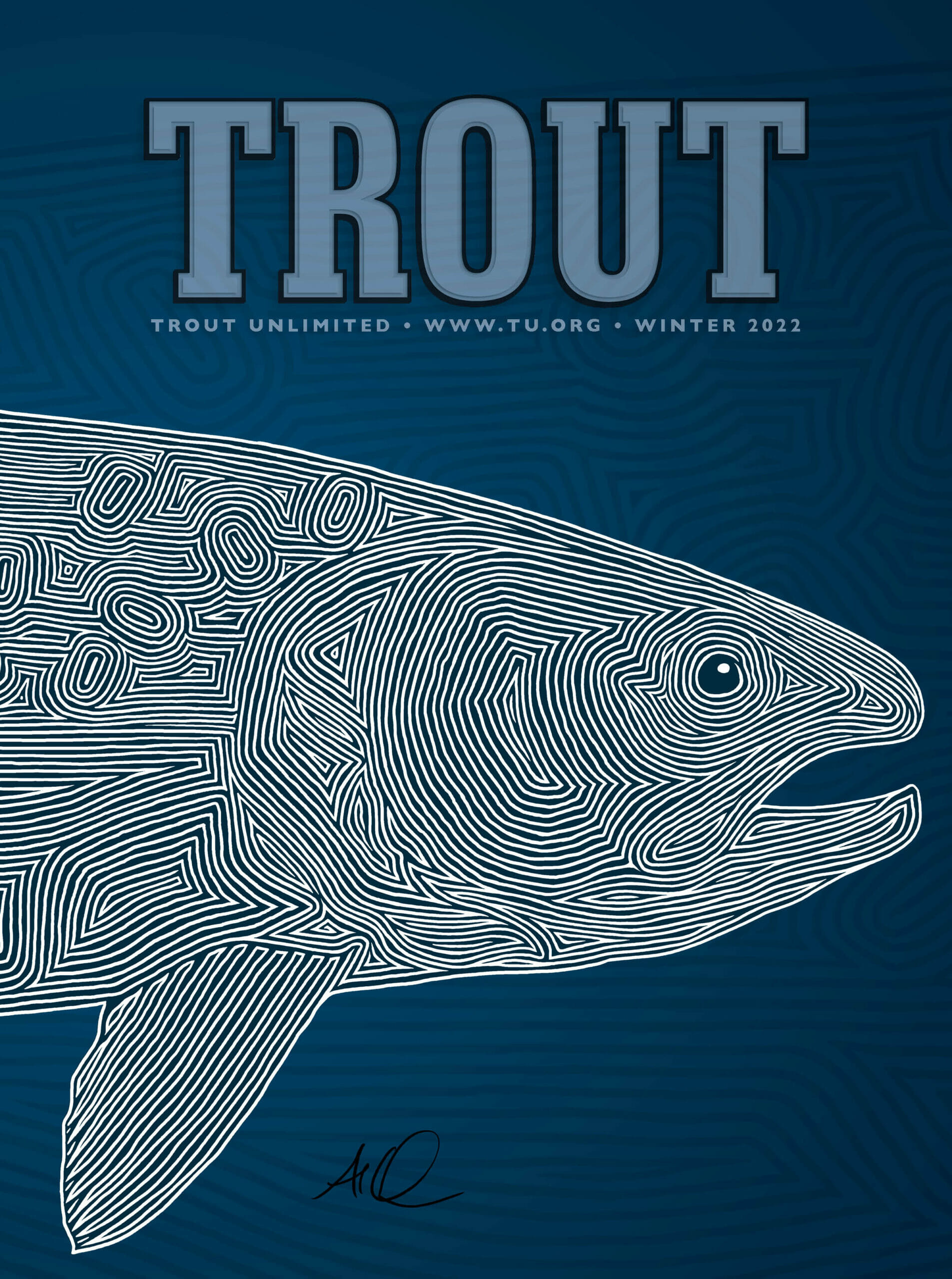
You recently designed the cover for TROUT Magazine and it’s a unique take on trout. Talk a little bit about the inspiration behind the most recent cover.
The recent trout illustration developed slowly from a painting I saw many years ago by an unnamed Aboriginal artist. This painting that inspired me was created as an abstraction using one connecting line. It really resonated with me. It looked like a dream that I couldn’t stop staring at.
So I wanted to play off that same process of an endless line and began drawing different saltwater fish like bonefish, tarpon and permit. They all look like topographic maps and were missing something. They lacked soul and purpose. So, I looked closely at the attributes of the fish I drew and broke them down into sections; gills, fins, textures, etc. and pieced them together with abstract lines. This worked and was a different approach to seeing fish I loved from a fresh new perspective.
My line influences also come from Keith Haring’s subway chalk drawings and Von Dutch’s insane technical Kustom pin stripping. There’s real power in a single line.
While TROUT Magazine is in print, I’m curious about your take on the digital age of graphic design/photography. Are we missing the mark of the good old days or are we in the age of unlimited possibility?
I know where you are going with this question. I still believe there a place for everything. Print is not dead! It is still an amazingly powerful tool.
Yes, the digital era is upon us; its faster, cheaper and more accurate in its execution, but I still think to some extent the final product lacks the warmth and soul of a handwritten letter or a freshly printed book. I like the tactile feel of holding a book or magazine in my hand and smelling the ink or feeling the texture of paper under my fingertips.
I think this will never go away, there’s something magical in this. Just like the old, pressed vinyl records are back in favor because their warmth and fullness of sound cannot be replicated by digital CDs. Everything goes full circle, sometimes we evolve too quickly and realize we did it perfect years before.
That goes for some fly rods too. This doesn’t mean the future is boring. I think if we are solving problems and moving the needle forward for positive change, we are on the right path.